|
|
|
|
|
|
|
|
|
|
|
|
|
|
|
Dec 12, 2017 19:31:10 GMT -6
|
|
|
|
|
|
|
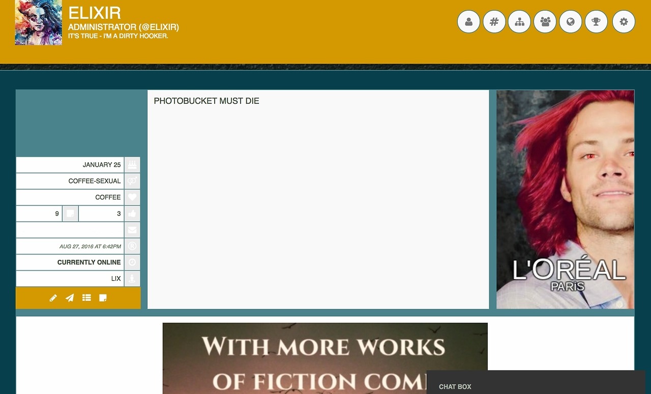
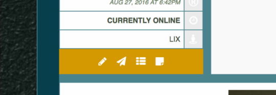
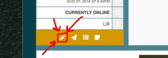
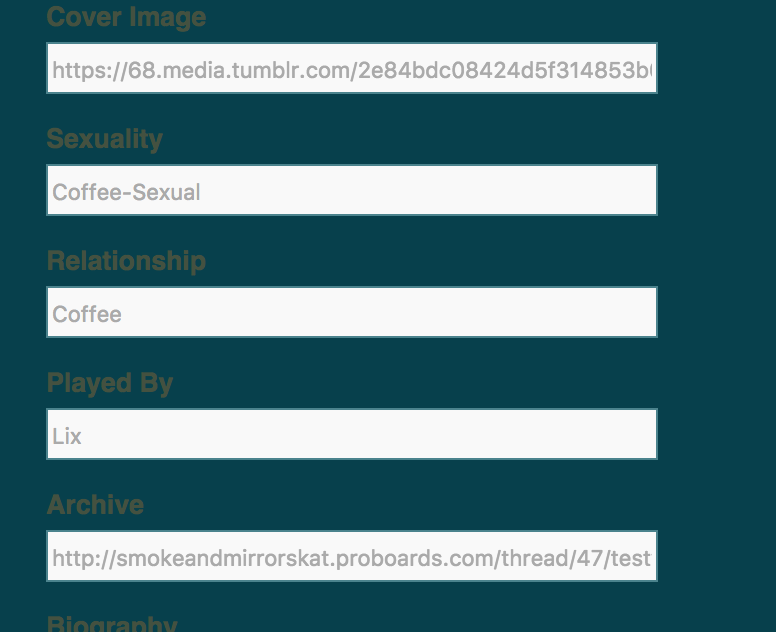
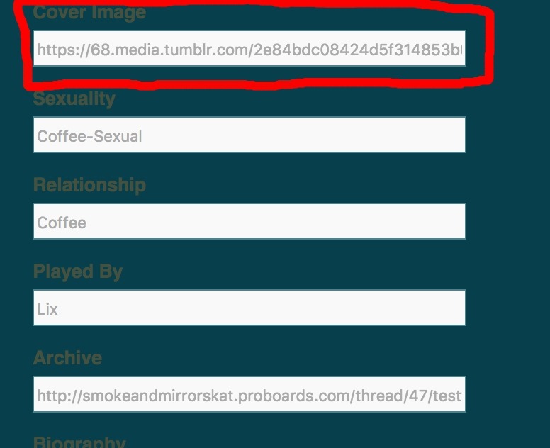
So you’ve made it to the site redesign! Good for you! You get a gold star for doing that! By this point, you’re probably looking around and wondering what on earth you should do next. Well, there are several things that you can do! The first step is to customize your profile(s) with all the new goodies that come with the redesign. But how do you do that? Not to worry - we’ll walk you through it. First, go to your profile by clicking it on the top of the page. Then, you should see something like this*: To edit your profile, look to the left to find the little pencil icon. Do you see it yet? Do you see it? Oh good! You’ve found it! Now, we move on to the actual edits. As usual, you’ll start off in the spot where you can change your avatar. You can change it if you’d like, or you can move on to the cool stuff. If you look to the top right, you’ll see several buttons that you can click to navigate through the edits. You can work your way through them as you so choose. (Click them! I dare you!) When you get to the third icon, you’ll find fields like these: You can fill them out for your characters there as you so chose. Also, we ask that you add a cover image for your character, which can be done by adding a link to the cover image spot like so: The dimensions are 220x350 pixels. DO NOT LINK THROUGH PHOTOBUCKET. Some good alternatives are tumblr, imgur, and tinypic. Now that you’ve updated your profile(s), you can move on to exploring the new site. There are lots of things that you can figure out on your own, but we’ll highlight a few of the big ones for you. Click these things! And this! And these! SPECIAL WARNING: There is an issue (that we are working on fixing) with switching between the quick reply box and the full reply box, so don’t do it unless you copy the text before switching. Better yet, write in google docs! And turn on drafts! SPECIAL COMMENT: Because the page is shaped differently, signatures are no longer required, but linking your character's profile in your mini profile IS. If you don't want to have your signature show up under your posts, but still want to keep the artwork, consider moving it to the top of your character's profile. Feel free to post comments or concerns below. Happy exploring! *Colours, images, and text will vary. |
|
|
Jul 7, 2017 6:55:37 GMT -6
|
|
|


